This is the third installment to the Carnegie client project case study – if you haven’t already, I suggest starting with Part I: Starting a Client Project followed by Part II: Making Style Frames.
Where were we?!
Last we talked about this project, the style frames had been approved and the stylistic direction for the illustrations set. Basecamp has a great analogy for the stages of production: it’s like going over a hill. We start at the base of the hill, climb to the top, then climb down to the other side. With most client projects, getting style frames approved means arriving at the top of the hill. We’ve worked out the big pieces – style, duration, scenes – and we can see all the milestones left.
This piece explores the process from the top of that hill down to final delivery. But let’s back track a little and take a look at the journey to the top.
Start of the Hill
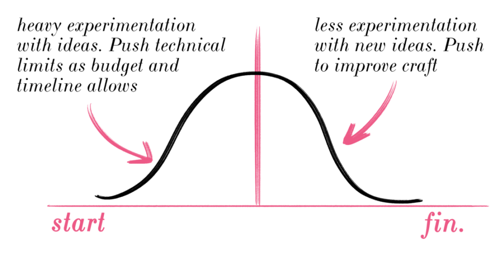
At the start of any client project hill, we wander around the dark for ideas and visual concepts. There are many unknowns in the project, we’re not sure the shape of what we want to make and we can’t see the other side of the hill. The time is ripe for experimentation.
This means trying out new tools, techniques and seeing how much out of the box thinking we can muster before presenting approaches to the client. This initial experimentation should be heavy on the ideas front: I want to play around with wild, unlikely ideas at this stage, while they’re still cheap. I want to be a little more conservative with technical experimentation, especially if a client project has a tight budget or timeline. We don’t want to try things so far out of our control that we fail to deliver the project. The amount of technical control we have should be able to withstand ten rounds of client revisions.
A bigger budget and longer timeline allows more room to experiment and push the envelope. A smaller budget and fast turnaround means relying on that in which we’re already well versed.
[Shakespearean Aside: most client projects fall in the latter category but it’s vital we keep experimenting in weird, unlikely directions anyway; this is why personal projects are vital. Okay – Cordelia, out!]
 Having played with a bunch of ideas, experimented with various painting, sketching and inking techniques, the style frames were presented and the client approved a set they liked. Huzzah! I had arrived at the top of the hill. Most of the project’s unknowns had been worked out – I knew how the final piece should look, and I was about eighty percent sure I knew how I was going to get there. From here, I could see the path down.
View from the Top
This is, arguably, the most enjoyable part of a client project.
With fewer unknowns and clearer boundaries, we can switch from experimenting with ideas to improving our craft. We can massage textures, tweak keyframes, draw a lock of hair just right. This kind of pushing isn’t as anxiety-provoking as the initial kinds of pushing, as now we have limitations to push off against – we’re bounded to the client’s approved style.
Here limitation acts as a source of creativity – we have complete freedom to push our work in whatever direction we want, as long as we stay within the walls. The walls afford us freedom. We try new transitions. We pay attention to getting our drawings accurate, our animations smooth. We’re focused because we can pour our attention into the details without worrying we’re drifting from the creative brief. The style frames provide us an anchor. It was now time to plan how each scene animated in and out and find, in the process, exactly what assets I needed to draw.
Animatic
I built an animatic, which is a draft of the final animation using rough shapes as placeholders. The animatic tends to be more for the artist than the client, but in this case, the animatic was a valuable visual guide for the web developers who needed to translate the scenes into the website. A detailed animatic on my end took a day or two, but saved many days of back and forth it would have required were the developers asked to animate all the transitions themselves, in code. It’s good freelance hygiene to solve problems you – and maybe only you – can see, especially when it saves time for your team down the line.
I was happy with how the drawings resolved onscreen. This gave me confidence in the laborious process ahead of drawing with ink, scanning, cleaning and animating each scene. As we roll on down the hill, hitting milestones, we lock in more and more pieces of the puzzle and the nebulous ideas and concepts we had at the beginning become more definite and refined.
Drawing the Assets
Remember those out of print old books on Russia from The Strand that nobody was ever going to pull off the shelves – much less buy – except for me? They turned out to be very useful at this stage, lending my drawings a historical accuracy that I otherwise would have overlooked. There’s also something cool about working with pictures in books (books, you old goat!) that we know haven’t already been circulated to death on Pinterest.
 It’s worth mentioning that at this point in the process, I don’t use other artists’s work as reference. As I’m barrelling down the hill, sketching and inking out my assets, other artists’s work become dangerous detours – if I look now, I’m tempted to copy. This is my chance to do original investigations of my own – I want to stay close to the original source. At first it feels uncomfortable – we want to hold on to the feeling of creating stuff that’s already proven popular – but these small opportunities are good times to exercise our own sense of creative direction. I’ll try to use references from real life, references from photographs if needed; references from completely different realms of knowledge.
Oh and I wanted to share one last thing those books taught me:
Get the Details Right
Using first hand references means none of the details have been left out. When we’re drawing from life, for example, we get all the richness of the model, the environment and the light straight into our eyeballs. When we use another artist’s work, we’re already stuck with just the information they’ve deemed important enough to leave in the picture.
The books I’d picked up from The Strand helped me get crucial details right – the Soviet-era clothing, the statues, the warheads. As a kid, I used to draw everyone’s sneakers as generic lumps with a circle for a logo and teeth on the bottom. A family friend noticed one of these prodigious works. He advised that when drawing, the details of sneakers are as important as the details on a face. Just because we don’t know what kind of sneakers someone is wearing, someone else who comes along and sees our drawing, might.

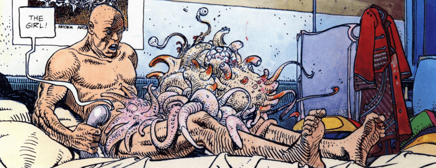
When that special someone comes along, we want them to get that jolt of connection as we get when we notice an artist has put care and attention in a detail only we thought was important. Case in point: many comic book artists use extreme, dynamic poses to show emotion – Moebius here shows shock and disgust by drawing curled toes:
The opposite is true, too. When an artist glazes over a detail or renders something inaccurate, you feel a little disconnected, as if they’ve dismissed something you feel to be important.
Let’s jump cut back to the ink drawings I was making for the Carnegie project.
Having been stewing in this style of ink drawing for many weeks now, I was drawing the assets with fluency. I scanned, cleaned and composited the images. The scenes were animated, cut and sent piecemeal to the developers for assembly.
The client was happy with the end result and I was happy with how far I pushed the project. More importantly, out of these inky experiments grew new works in ink, notably my work on my personal Bukowski project and new work for The Academy of Ideas.
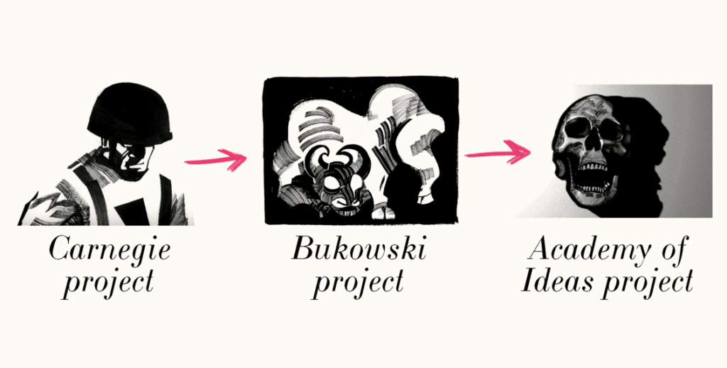 All of these newer pieces have their roots in experiments done for the Carnegie project, and we’ll see where it develops from here.