The last piece in this case study series walked through the process of project research and putting together moodboards. The client moved us into the next phase of production upon approving the ‘graphic/illustrative’ direction based on my moodboards.
This piece is a deep dive into my process of building a set of style frames within the constraints of a project budget and schedule.
The Function of Style Frames
Style frames serve two purposes:
- To show the client what the final product could look like.
- Help us build a technically feasible visual language for the project.
Here’s a brief elaboration on the points above.
The first point is obvious. This is your client’s initial glimpse into the shape of their project. Style frames set a visual standard for the rest of the work and assure clients we know what the hell we’re doing.
The second point is less obvious. Since we’re building samples of what the final product looks like, we need to figure out the visual language before we assemble style frames. Much stylistic experimentation is therefore front loaded on client projects, giving us a handle the technical demands in achieving the options put forth.
As creatives, the end goal of all the work we do is to develop and hone our own processes. These form our own creative path and imbue projects (client or otherwise) with originality.
So…
Learn a New Tool on Every Client Project
Artists who have differentiated themselves are ‘artists who have their own style’, but concentrating on aesthetic differences means missing out on the actual mechanisms that cause an artist to be different: their processes. A process is the transformation of resources (tools, ideas, energy) into products of greater value:
“The patterns of interaction, coordination, communication, and decision making through which [we] accomplish these transformations are processes.”¹
The way Picasso observed his subjects, mixed his paints and made decisions on the canvas constitute his painting process. Every step in our client projects are opportunities to experiment with new tools to build our processes.
Style frames is the first such step.
I always try to push style frames into new stylistic territory. This push starts from any number of places: a new plugin to try, a new material to play with, a new animation technique, etc. As freelancers, we rely on this curiosity and willingness to push our craft in order to differentiate ourselves. Attaching new tools and techniques to client projects also keeps the work exciting – and an exciting production process births exciting results.
First we’ll need some parameters lest we get lost in our explorations.
Thumbnails
Thumbnails are the scaffolding that hold everything together behind the scenes.
Unlike the encouraged chaos of my personal projects, we can’t spend nearly as much time experimenting on client projects. After all – clients pay for our experience, not our experiments.
(Side note: ironically, without experimentation we tend to stick with what’s been done before and our work gets dull. Exciting, unexpected results come from continued experiments building on our existing knowledge, so we need to carve out time for experimentation on client projects. This is one of the reasons I prefer to charge by the project. I’m currently writing a piece on the topic of hourly vs. project billing.)
I reviewed my notes and used a couple days to sketch out ideas. Starting with key ideas mined from the research I then expanded out with my own associations:
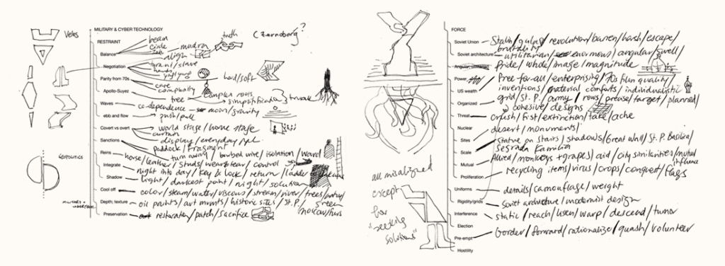
A technique I learned from Sterling Hundley is to word associate using two opposing idea. You might associate a set of words for ‘hot’, followed by a set of words for ‘cold’. You then attempt to connect your associations with one another – ‘oven’ with ‘ice cube’, ‘desert’ with ‘igloo’, ‘hell’ with ‘angel’ and so on. This exercise breaks your brain out of its habitual categories and combines ideas that don’t typically pair. Cool.
From this exercise, images started flashing to mind which I sketched next to the words.
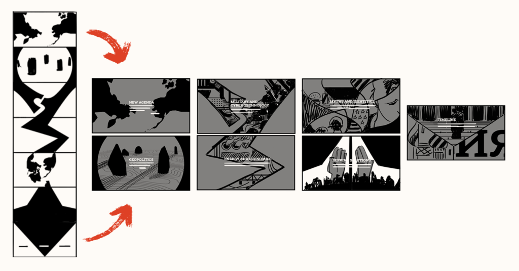
The Carnegie New York project was to be an interactive, comprehensive resource on the relations between US and Russia. Its aim was to educate and propose more productive and peaceful ways forward and there were seven chapters in total. I created loose, graphic thumbnails which I fleshed out to go along with the style frames:
I wanted to infuse the goal of the site (promote peace and stability between the two superpowers) into the visuals without hitting viewers over the head with my Clever Ideas. Peace signs, doves and olive branches were out. I had to dig past the graveyard of overused ideas and get to more nuanced lands.
A good way to do this is to draw on personal associations:

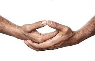
In the Military and Cyber Security thumbnails above, I drew on what symbolized peace and stability in my own life: the center thumbnail is based on my zen practice. The form of meditation practiced in zen is called zazen, which has us hold a Dhyana mudra with our hands. Simplifying this posture gave me the graphic shape for the scene, which was kept as part of the final illustrations. These personal connections give us a sense of ownership for the work and allow us to move past cliches in idea generation.
Now that the scaffolding was in place, I could choose one scene to turn into style frames. Knowing where in the sequence this scene was going to be – what came before and what came after – offers confidence in building style frames that make sense in the broader context of a project.
Next we’ll look at the actual process of creating the style frames.
Experimentation vs Control
Earlier I suggested incorporating a new tool or technique into each client project.
At the time of this Carnegie New York project, I was getting into oil painting and wanted to see if I could create my final pieces with oils. I hot footed it to Dick Blick, plugged in my credit card and got an armful of oils, brushes and canvases.
I picked the Military and Cyber Security thumbnail and got down to painting me some style frames.
I spent hours putting one layer of paint down after another. Nothing was quite working. Slowly, it dawned on me I had little control over this medium. Experimenting with new stuff allow us to learn the stuff better but also to learn what we don’t know. Here in front of my canvas and easel – was a lot I didn’t know. I’d need to develop way more control of the medium to come close in expressing the compositions in my head.
Ricky Mujica said something useful to me while in a figure painting class. I was having trouble fitting the whole figure on the canvas – I kept starting with the head and then running out of space. He came over to my easel and drew a horizontal line at the top of the canvas and one at the bottom. He looked at me and said, “you’re the painter. You control the painting, the painting doesn’t control you.”
In getting familiar with a new medium or tool, we’re experimenting and playing but we don’t yet have control over it. We might get some cool results here and there but we have no idea how we got there or how to get back there. This is the kind of experimentation best reserved for personal projects, when we have time to stumble around and produce a pile of unusable crap in an effort to learn.
The constraints of client projects means we have to pick our new tools carefully. If it’s too complex, we run the risk of not getting creating what we envision and doing a bad job for the client. Err on the side of choosing tools you can learn to control within the scope of the client engagement, and within a wider context of skills you already have great control with. More on this in the section to follow.
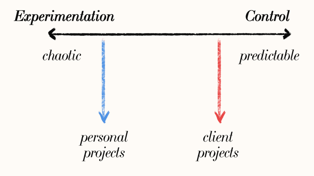
In my case, needing to learn how to control oil paints was a way longer term goal than this client project allowed for. I shifted gears, moving myself further along the continuum to the Control side of things.
Was there a way I could still incorporate oils in a way I had much more control over the medium? Maybe I could use it as a vibrant texture instead.
I took some photos, composited the textures with my graphic shapes and sent off the first round of style frames:
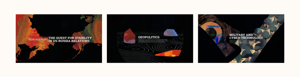
Building a Visual Language with Inks
Feedback eventually came through – although the colors against the black background was striking, it didn’t fit with the rest of the content, which was set against an off-white.
Back literally at my drawing board, I revisited other avenues I was interested in pursuing. If paints weren’t the right approach, maybe I can turn to inks.
Having played around with inks on some smaller personal projects, I was well past the purely experimental phase of using the medium. I was confident inks was something I could get good at in the duration of this client project. Inking would also build nicely on my pre-existing drawing skills, meaning I had a much broader context of experience and competence to draw from when learning this new medium.
I made some initial ink drawings:
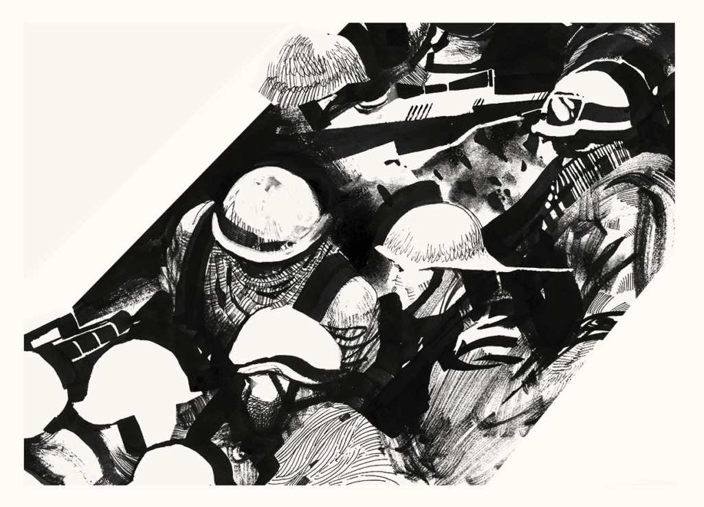
As I learned to better control the ink and brush, I started writing down what I liked and didn’t like about my results. I took out the thinner pen lines, which were too precise for me next to the evocative splotches of ink. I didn’t want the viewers to get caught up in the busyness of lines. Building out a document of what worked and didn’t work meant I was simultaneously creating a visual language and explaining how to use it.
This is a process I detail in my course.
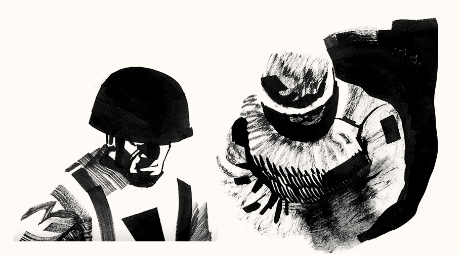
Over the next days and weeks the language kept evolving. In the beginning my characters would look different from one attempt to the next (much like how handwriting changes depending on what pen and paper you use), but over time the drawings gained more coherence. It’s as if my brain was processing each inking attempt and learning to speak more and more fluently in this new language:
Once I felt the language was cohesive enough to be spoken throughout the project, it was time to submit my style frames.
Finalized Style Frames
I packaged and submitted the new round of style frames:
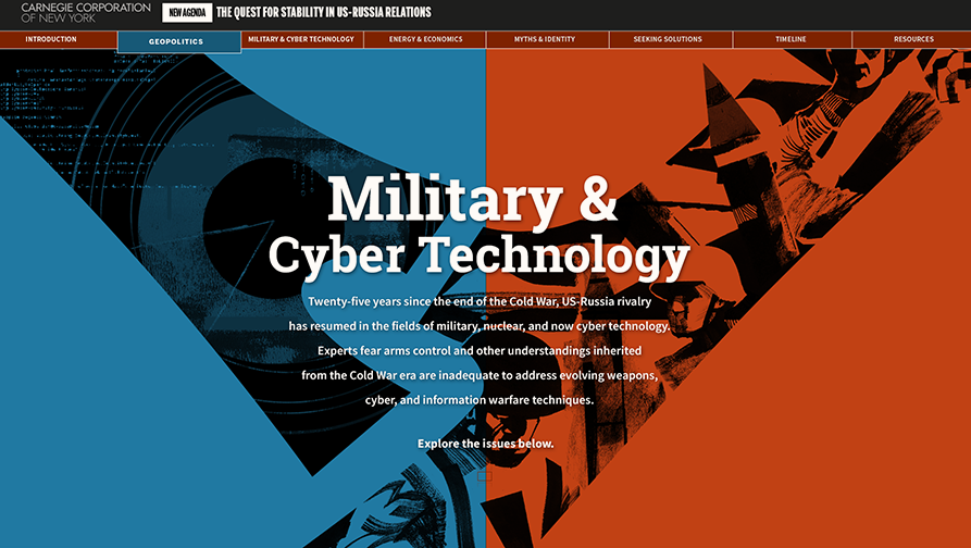
The client approved the visuals and gave the thumbs up to create the rest of the assets.
Along the style frame journey I’d learned my limitations with oil painting and the possibilities of inking. This was all information I wouldn’t have gained if I just stuck with tools and approaches I already had confidence in. The next step in the process was to create the rest of the assets in this now client-approved language and then animate all the pieces.
I turned off my light, packed my oil paints and signed up for a figure painting class.
References:
- Christensen, Clayton M. and Raynor, Michael E. (2013). The Innovator’s Solution: Creating and Sustaining Successful Growth. Harvard Business Review Press. pp. 183.
Go out n make some smoov style frames (hat tip to Mr. Cruz). Thanks for reading and I hope you enjoyed this piece as much as I enjoyed putting it together 😊
Got questions? Feedback? Cannonballs? Leave ’em below.
Does this echo your style frame creation process?