Mid last year I was brought on by my long time collaborator Brian Storm to partner on Burner Face, an interactive podcast being custom built to thrive on MediaStorm’s new platform.
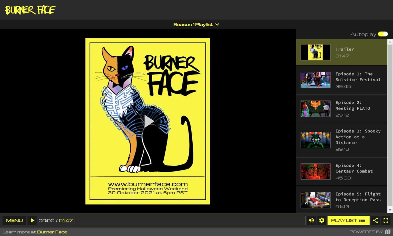
I created five animated covers for each of the episodes in the series as well as a logo for the podcast.
Below are highlights from an in-depth interview I did with Brian on the making of these pieces. You can watch the full interview here.
Enjoy.
How did you get into designing things?
I don’t have a formal educational in design or fine arts and I’ve flip flopped over the years on whether that is a good thing. Ultimately, I think it’s been a help.
As a kid, I drew a lot. Specifically, I drew the backs of my classmates’ heads on reams of butcher paper my dad brought home from the meat factory he worked at.
So when I later fell into motion design, that thread of drawing (and later, painting) continued to run through my work. I’ve always been self taught and independent in that way, chasing a different aesthetic than what’s popular in the moment.
Do you think you’ve found your style? Did working on Burner Face help with that?
Working on the Carnegie New York project was my first opportunity to bring my ink drawings into production. I liked not knowing in advance what was going to appear on the page and not knowing in advance what it was I was looking for, allowing what was happening on the page to surprise and take me in a direction I couldn’t have thought to go in before.
That was the first project that got me onto this aesthetic and since then it’s been about how I can push it further. How do I add more dimensionality to the drawings? How do I keep people’s attention with this style, that’s experienced just on a screen?
It was from asking and experimenting with those questions that I’ve come to my current aesthetic. Burner Face gave me another opportunity to push this aesthetic in production; my ink drawings started off in black and white—would it work in color?
Every project is another stab at playing with and resolving questions that I have in that moment.
What was the process to bring these visuals for the podcast to life?
Working on Burner Face was a departure from the other client work I do. A large part of my responsibility to clients is knowing and communicating in advance how a project is going to look and how we’re going to get there. The pieces have to get worked out in advance of creating the visuals, because most clients want their projects done quickly and there isn’t a lot of time to experiment.
Burner Face was an opportunity to return to the imagination; to start with nothing and to figure out how something could be represented. When you’re in the realm of imagining something from nothing, you have to figure out a backstory, you have to figure out a kind of “living logic” for the visuals you’re creating so the style and the contents of what you create are coherent.
A podcast in particular gives the designer tremendous freedom to translate into visuals. It’s a return to that simple, childlike place of listening to a story and allowing your imagination to populate your inner space, without being shown explicitly what something looks like or how it works.
Relying on imagination itself to build a whole visual language has always been difficult, and now there’s even less incentive, given that I can find endless visual reference by typing some words into Google.
Since Burner Face is set in a hypothetical future, a lot of the concepts and gadgets the story is built around hasn’t been invented yet or exist in very rudimentary forms, so I was forced back into the imagination to try and figure things out from scratch instead of simply iterating on existing designs.
Let’s talk about each of the illustrations. How did you decide on the first cover of the series?
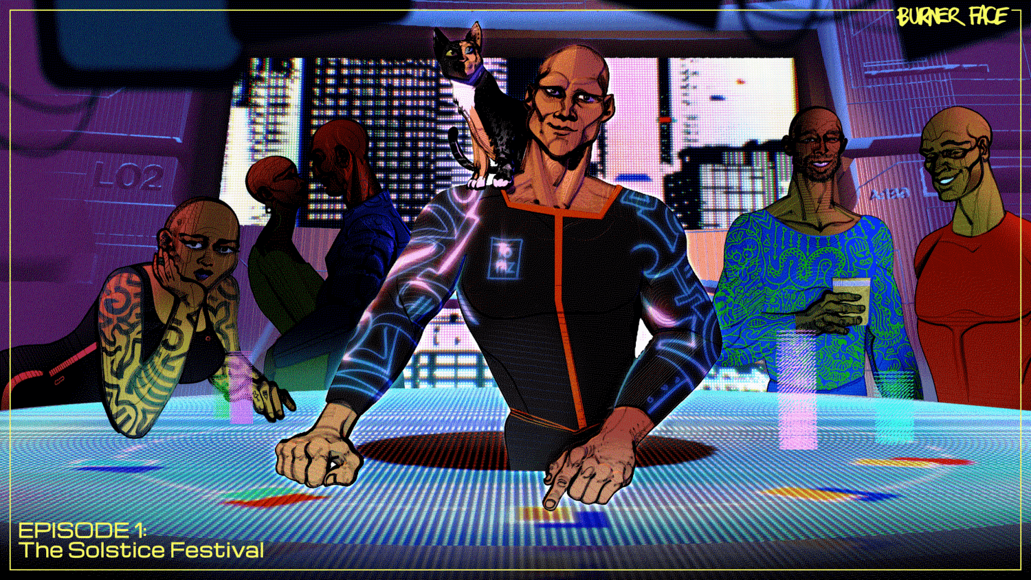
I knew the first illustration for the series couldn’t just be a scene plucked out of the episode and turned into a visual, because it needed to drop hints about the world, the characters and the story all at once. So we took a bunch of interesting parts from the first episode—the protagonist Boone, Vincent the cat and the floating casino—and mashed them together into something of an invitation into this future world.
A lot of small details had to be thought out for it all to come together—how does Boone carry himself? What clothes does a person living in our future (hotter) climate wear? What kind of attitudes did the other people in the space have?
At some point it seemed possible that people of the future might all be bald, owing to some combination of climate, air quality and food intake… so that’s also why all the characters are bald.
How did you animate the drawings?
I’ve been playing with a kind of slow, animated aesthetic. A lot of the client work I do, in motion design in particular, is super fast paced. We know that people’s attention span is getting fragmented, so the response has been to cut things faster and faster, because we feel we’ve got to fit into those smaller and smaller shards of attention.
On the other hand, we still have all the attention in the world for the things that are genuinely fascinating to us. I went to see Lucian Freud’s exhibit in Boston just before the lockdown and I remember walking through the gallery and looking at some of his paintings for ten or twenty minutes, just being absorbed in one picture, because there was enough presence in a single image to hold my attention for that amount of time.
If you’ve ever seen his paintings, they’re quite stark and bare. Nothing in it screams for your attention; there isn’t a lot of movement or characters or bold colors. But the pictures have so much presence in them that it’s very exciting to stand and feel them unfold in your body and brain.
I wanted to bring that same quiet unfolding to the pictures I was making. Pictures that don’t depend on crazy movements or flashing lights to keep your attention. They either have enough presence to unfold in your attentiveness, or they don’t.
So the animation I’ve been experimenting with is very much in the vein of a painting you get to know over time as it slowly reveals itself to you, on its own terms.
Each of these illustrations are like book covers. How did the cover for episode two come about?
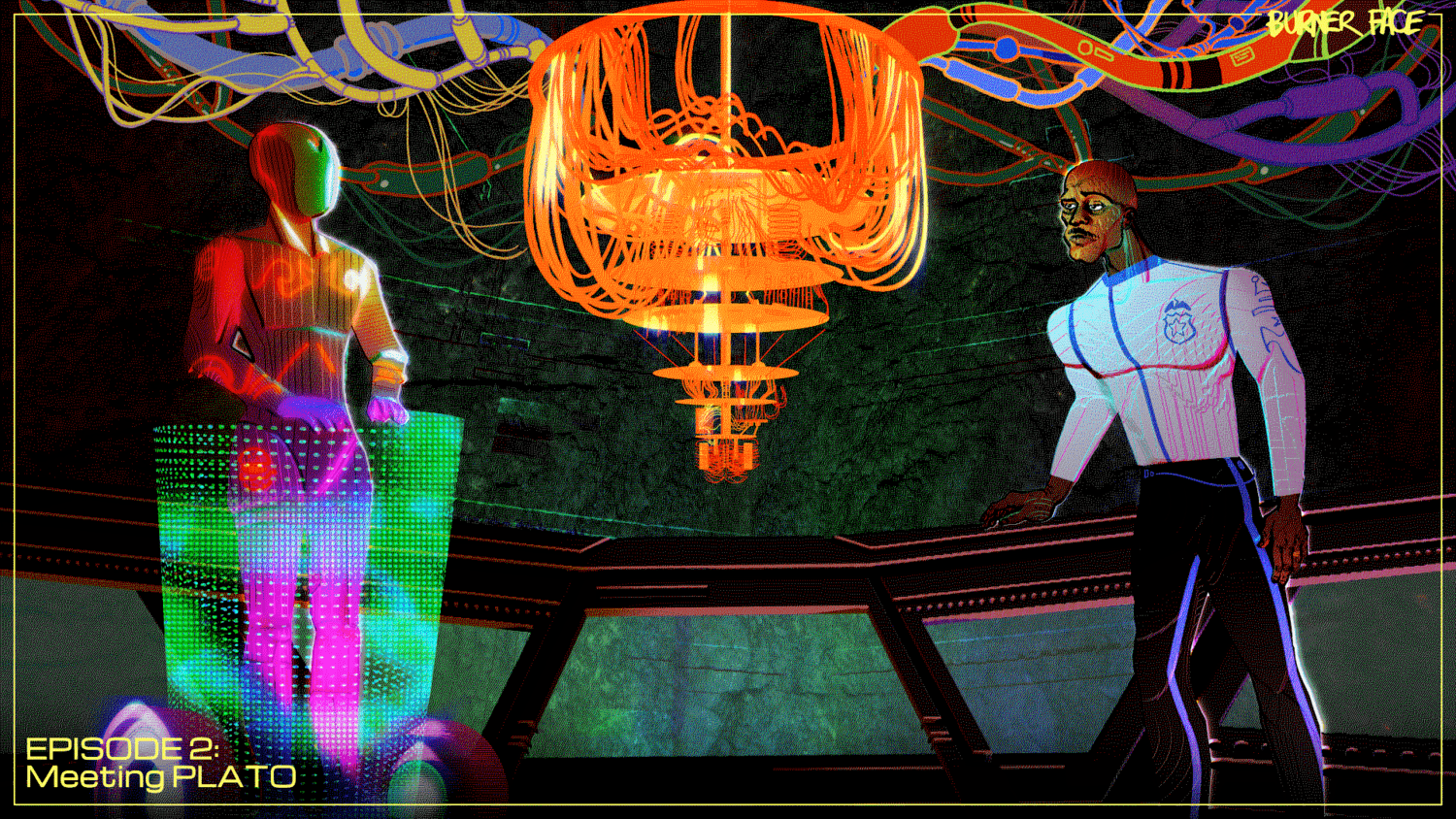
We wanted each episode cover to reveal a different facet of the podcast, so we decided that each episode should have one or two characters as well as an environment. The challenge in this second cover was scale: how do I show a very large cave while also placing emphasis on the characters? Showing too much of the environment sacrifices the detail of the characters. In the end we decided that showing the characters was more important than the environment, so each of the illustrations ended up with the characters as the center of attention.
How did the third cover come about?
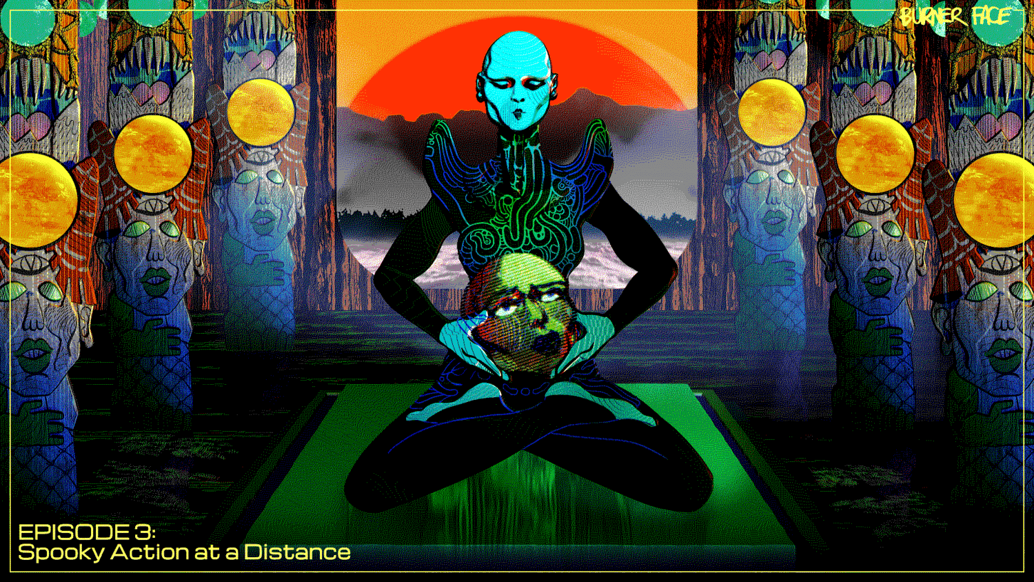
We started with the idea of a full body Celeste in the palm of De Bono’s hand, but visually it was difficult to read, given how much else there is going on in the scene. To simplify the scene and make it more impactful, I drew inspiration from the painting Salome Bearing the Head of St. John the Baptist, where the severed head really becomes the centerpiece of the picture. That really helped anchor this picture and give it a strong focus.
It also makes it more macabre.
Which I like.
The fourth cover?
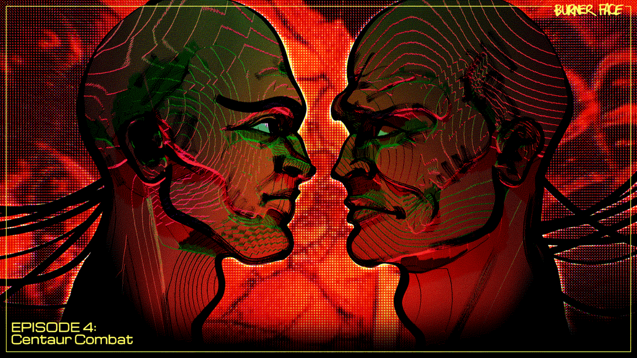
This one was pretty easy because I’m great at drawing scary, slightly hideous men. There’s this joy I have in drawing men’s faces and hands, because there’s a kind of freedom you have with drawing lines and scribbles that just add to their character.
The last cover?
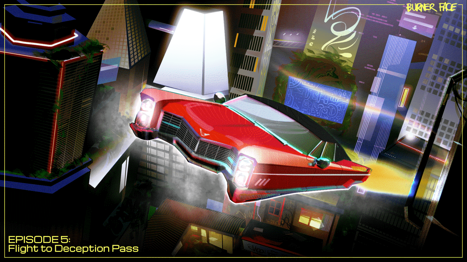
This was quite a challenge because I had to depict the future Seattle portrayed by the podcast. There are so many depictions of future cities out there—Blade Runner (new one I hate, old one I love), Cyberpunk 2077, Ghost in the Shell to name a few—that we’re all literate in what future cities are supposed to look like: lots of screens, neon lights, pollution, projections, flying cars, etc. So the challenge was in creating a city that speaks in that same “future cities” language we’re all familiar with, while portraying something that was true to the technologies John (the creator of Burner Face) explored in the series.