Artists stand out by having a distinct creative vision. This vision develops through years of experimentation and consistent output; it is something representing our tastes, our knowledge of ourselves and our skills.
Are there ways of speeding up this process?
Yes. One way is to analyze the work of artists we love. We don’t just admire and move on, but take time to digest. Understanding the why behind our admiration of a picture makes us less opaque to ourselves—we can more quickly find patterns in what is attractive to us and what makes us bored. Discerning the difference, we become more capable of knowing what we want from our own work.
I went through this process and analyzed three artists to illustrate how reflecting on work we love can shine a light on our own path.
We’ll begin with:
Mort Drucker

[Edit: Mort Drucker has just passed away. The generosity of your work lives on in the generations of artists who looked to you as their teacher. Rest in peace, Mort.]
I encountered Drucker’s work by mistake. I was nine and deep into The Simpsons when my uncle offered to buy me a magazine at the train station. I picked:
Flipping through it on the train, I realized it was no Simpsons adventure but cartoons of kids with zits, barfing kittens and movie parodies. After the initial disappointment and mild disgust I zipped through one of the movie parodies and was hooked. I started collecting issues of MAD magazine and continued well into my teens, ripping off Drucker’s work for art assignments and trying and failing to figure out how in the holy hell he drew such amazing hair.
His strong draftsmanship kept his work lively and subtle, providing me years of art lessons in the guise of MAD movie parodies.
A few things I learned from Mort Drucker:
Every Character Needs a Personality.
Mere exaggeration doesn’t add personality to characters—it’s often just a display of an artist’s lack of ideas. Dramatic, exaggerated action poses (especially in comics with its many panels) fatigues the reader.
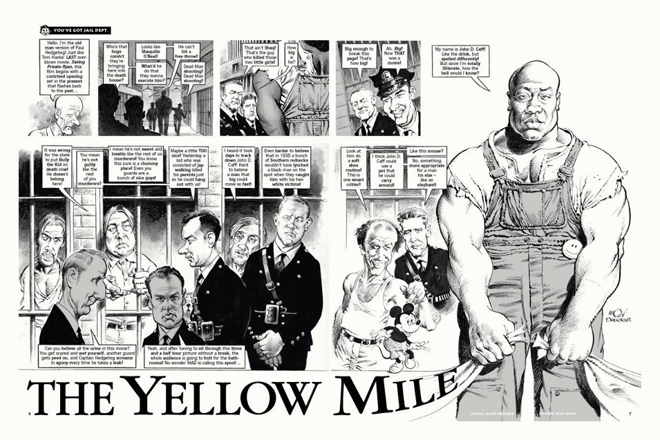
Drucker never resorted to a caricaturist’s tricks (buck teeth, big ears, small bodies) to capture likeness. He needed only a front-on and a profile shot of any actor to render their likeness from any angle so that, unlike most caricaturists, he did not lean heavily on reference photos to convey a character. Able to position characters’ heads in any perspective while maintaining likeness, Drucker could freely pose them in scenes exploiting not just their facial expressions but also body language to convey the personalities embodied by the actors themselves in the films being parodied:
Tackle what is Difficult.
Most of us avoid drawing hands and hair because they’re as complicated to draw as faces, yet don’t yield as much mileage. Hands stuffed in pockets and dark lumps passing for hair really don’t detract from the reader’s experience. The same cannot be said for a wonky pair of eyes or a head tilted in failed perspective—being social animals, we’re hyper sensitive to facial details.
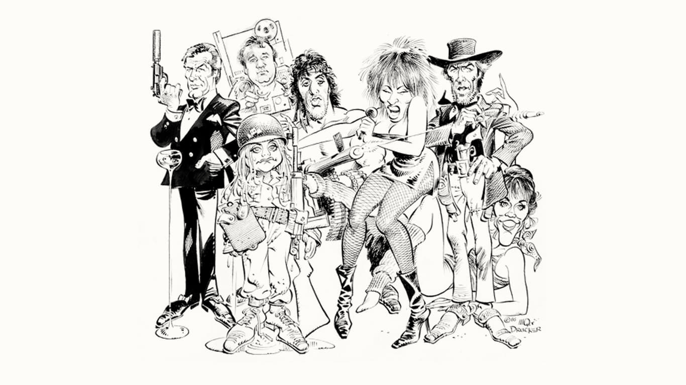
Drucker’s willingness to draw endless (endless) hands and all hair types shows a love not only for his craft, but for his audience; we receive richer characters for it. Depicting hair and hands when they could have been hidden without cost to the story shows the artist’s excitement at creating the characters, which become our excitement upon seeing them. The commitment to rendering details other artists would rather avoid ensure Drucker’s work will endure beyond the pages of MAD.
Find the Necessary Marks.
Slathering a work with unecessary detail results from an artist’s lack of confidence in their ideas. Every artist passes through this phase. In the beginning, we don’t know what our ideas are and therefore can’t tell which marks are necessary in communicating them.
So we make a mess of marks and hope some of them land. As we mature, we have a better sense of which marks are necessary, allowing details to grow out of strong ideas and discarding marks that are really embellishments covering up what was weak to begin with. We can trace this development even in Drucker’s work—note how many lines he was using in the 60s as opposed to the 80s:
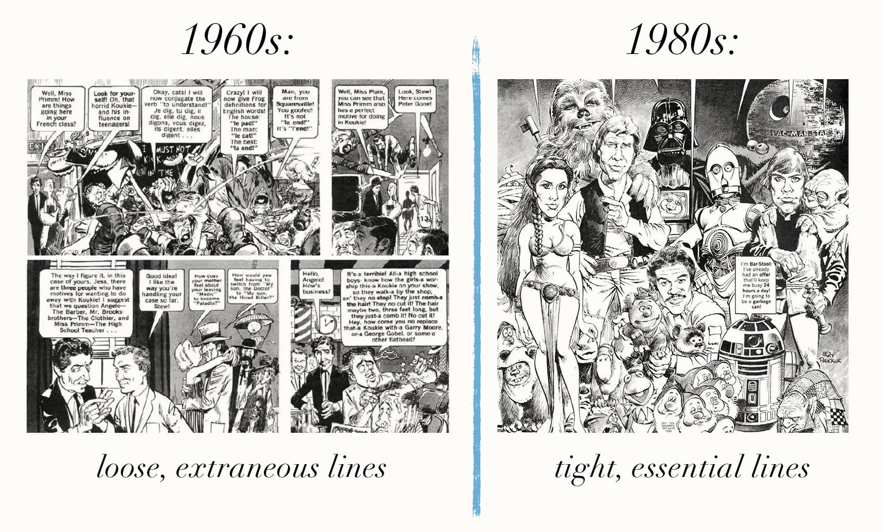
Strong marks in the correct places give strength to a picture; unecessary marks take force away and weaken a picture.
At the same time Mort Drucker was inking hair and fists in New York, a prolific Frenchman tripping on LSD was making comics that would shape sci-fi worlds in pop culture for the next forty years (and counting).
Jean Giraud (Moebius)
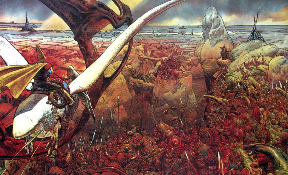
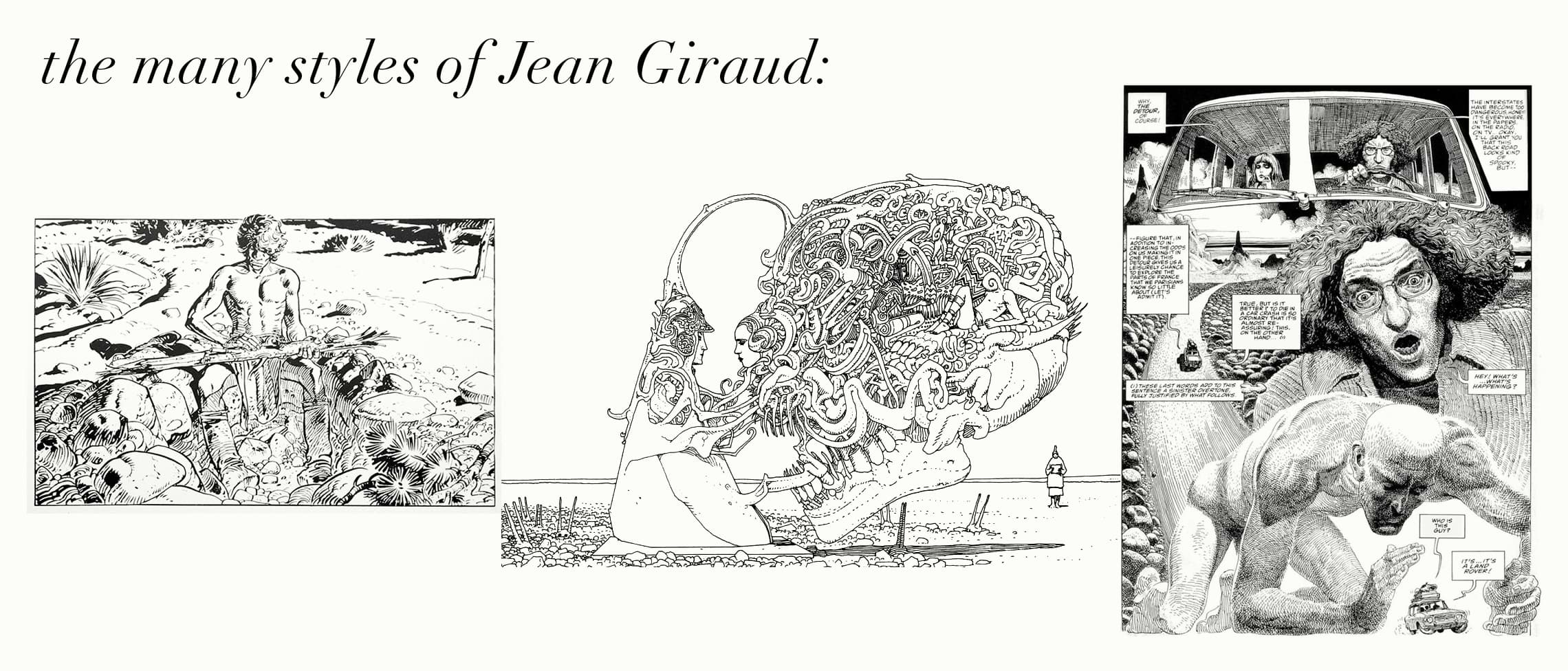
I discovered Jean Giraud’s (aka Moebius) work when a friend recommended I watch Jodorowsky’s Dune. By all appearances Moebius was a specialist—his narrow field of specialization was comics. But far from constricting his creativity, Moebius’s specialization kept him grounded as he pushed the design, storytelling and visual boundaries in genres ranging from Westerns to sci-fi to erotica.
Some lessons from Gir:
Generalize within your Pigeon Hole to Get Out of your Pigeon Hole.
Artists squeezes themselves into pigeon holes so they can build the discipline necessary to get better at their craft. Artists also hate this process. It feels we’re doomed to do One Thing Forever which will certainly kill our Vast Potential and waste our Talent. Jokes aside, with all the mediums and tools at our disposal on the cheap (Blender is free for Chrissake) it’s no wonder we can’t focus.
Giraud is a shining example of how pigeon holing yourself early on can propel you into different fields later. His entire career was spent writing and drawing comics, but he pushed the boundaries of this narrow specialization, continuing to draw the Western comic Blueberry even as he was publishing sci-fi and fantasy stories under the pseudonym Moebius.
This broad exploration of styles, stories and ideas had him synthesize all this knowledge into one discipline, giving his work a consistent thread, making him into an ever more revered figure in the comics industry. As Giraud’s body of work grew, he became a pinnacle that could be seen from fields adjacent to the comics book industry. Film directors came to him with projects ranging from Alien to Tron to The Fifth Element, and his comics became a direct influence on sci-fi staples like Blade Runner and Star Wars. (More on this later.)
The more ideas an artist wants to play with in their work, the more the artist needs an overarching constraint to hold everything together. The discipline of drawing comics was what focused Giraud throughout his decades-long career:
Design the Details.
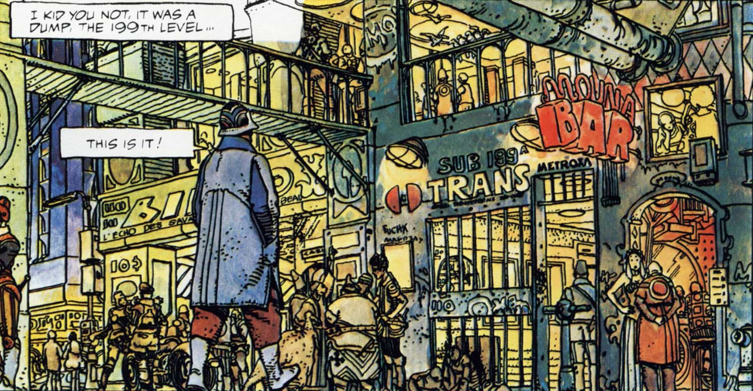
Giraud was known for the worlds he created as well as for his stories.
When we think of worldbuilding we think of grand landscapes, funky architecture and fog. (Lots of fog.) These grand establishing shots impress us, but they do not make the world come alive. What do the inhabitants wear? How do they get around? What are some everyday household appliances? Being privy to that level of detail gives us the sense we’re immersed in a living, breathing world instead of a studio set.
Giraud was capable of designing both the grand, sweeping gestures of his worlds in great detail—
—while preserving that same enthusiasm for detail in mundane scenes:

This is in sharp contrast to most popular comics, which rely almost exclusively on character action to hold our attention.
Giraud’s richly detailed worlds captured the attention of Ridley Scott, who based much of Blade Runner’s visuals on Giraud’s designs from his comic (written by Dan O’Bannon) The Long Tomorrow—from flying cars to detective outfits:
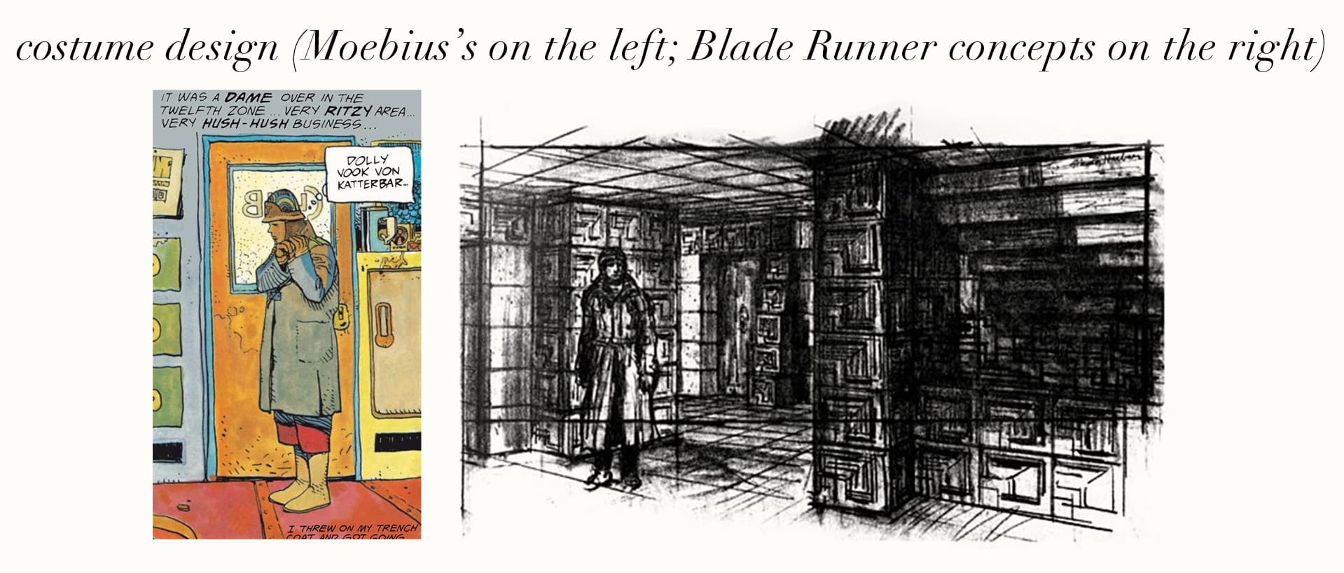
A design dashed off by Giraud in the background of another panel in The Long Tomorrow also became the inspiration for the Star Wars imperial probe droid.
Designing the details allows multiple aspects to carry the story—outfits, landscapes, vehicle interiors all enrich the world, leaving room for characters to be fully human instead of being in perpetual action poses to push plot along. Giraud elaborates:
“[It’s] very difficult to draw a sleeping body or someone who has been abandoned, because in most comics it’s always action that is being studied. It’s much easier to draw people fighting — that’s why Americans nearly always draw superheroes. It’s much more difficult to draw people that are talking, because that’s a series of very small movements — small, yet with real significance. His counts for more because of our human need for love or the attention of others. It’s these little things that speak of personality, of life. Most superheroes don’t have any personality; they all use the same gestures and movements.”¹
Make Connections with your Art.
A common worry from readers of this blog and students in my course is that creative work requires us to spend a lot of time alone. This isolation will lead us to lose touch with reality, take too many drugs, speak in tongues and refuse to wear pants. (Valid concerns.)
The truth is those who want to output substantial, creative works must embrace solitude. It’s solitude that allows us to discover original conclusions. But it’s also in these uncharted caves we confront, again and again, the monster who lives there: loneliness.
Up against this awful toothy beast we need strong convictions as to why we show up to the caves in the first place. Here, we need to expand our understanding of what it is we’re doing. Maybe being locked in our studio or our room, writing, painting, drawing is not just missing out on social connections in the short term but the means of forging connections durable beyond our personal sphere. A body of work as prolific and of such amazing quality as Giraud’s has the ability to carry on conversation for generations; this is why we show up and face the monster who is guardian to the possibility of connection beyond the mundane. Giraud said,
“To begin with, drawing is a form of personal communication — but this does not mean that the artist should close himself off inside a bubble. His communication should be for those aesthetically, philosophically and geographically close to him, as well as for himself — but also for complete strangers. Drawing is a medium of communication for the great family we have not met, for the public and for the world.”²
Lucian Freud
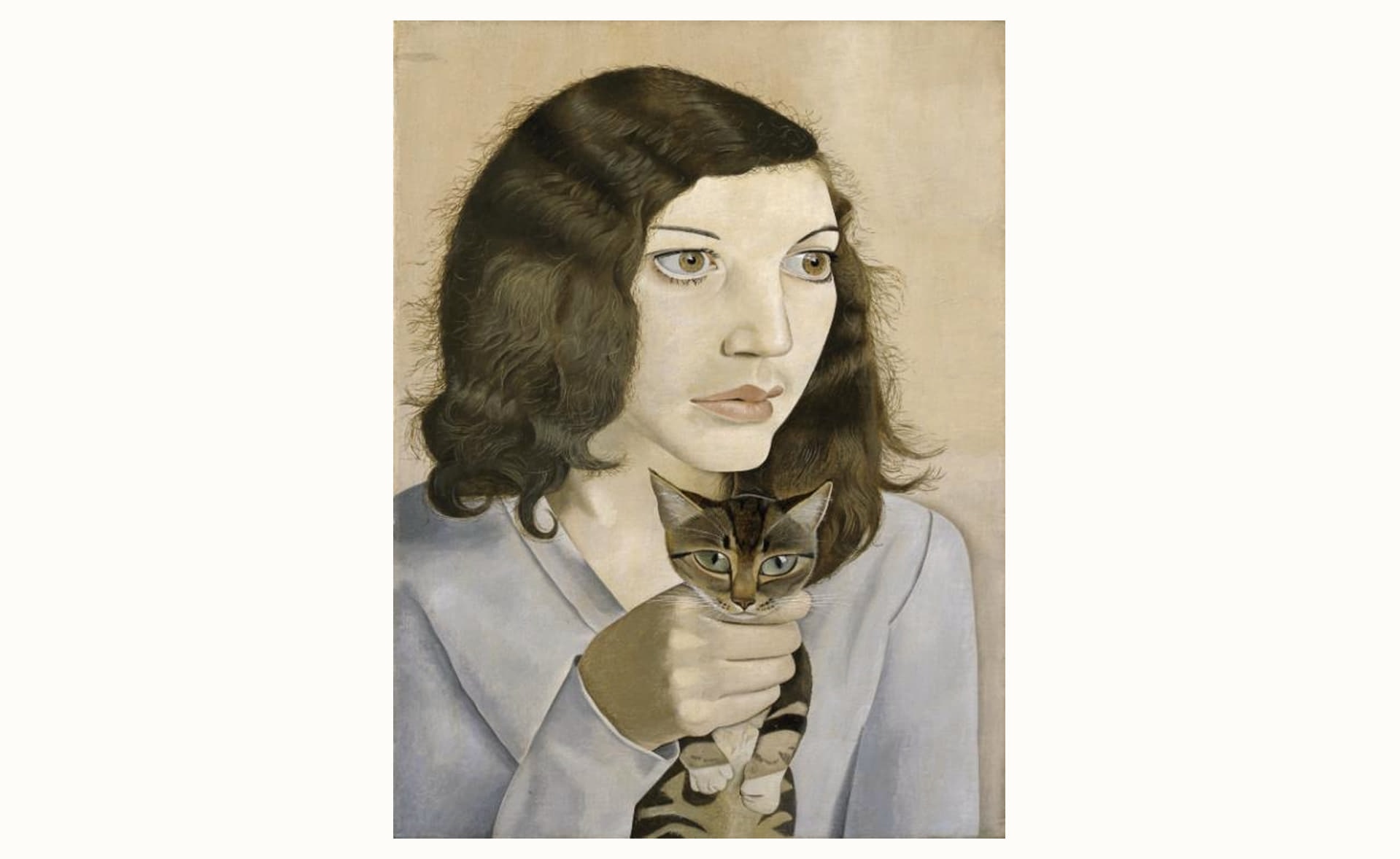
I rushed through an exhibit of unfinished paintings at the Met Breuer when a shard of paint on an otherwise enormous blank canvas made me stop. The fragment was entirely finished: an energetic, concentrated island of paint in a sea of blank. Freud, who worked by painting and finishing tiny sections at a time without the guide of elaborate underpaintings or sketches, compressed onto his canvasses hundreds of hours with each sitter.
Some lessons from Freud:
Don’t Dictate—Follow.
We can use a couple different methods when creating work: plan meticulously ahead of time or pick a broad direction and just see what happens. Creatives in the former camp tend to create work that is technically proficient but lifeless—they’ve built a beautiful house with no one in it. Those in the latter camp tend to make work that’s full of feeling and imagination but lacking in discipline. Freud was always the latter kind of artist, not bothering with proper perspective or anatomy, instead training sheer concentration on his subjects to force discipline into his work.
Freud’s process was to start in the center of the canvas and expand outward, a few charcoal marks guiding the entire picture. It’s unthinkable for most painters—it feels almost reckless (no guides?! What if our proportions are wrong? What if her feet don’t fit?). This allowed Freud to grow a painting and follow what unfurled in front of him. He wanted the picture to be alive and to constantly surprise.
I love this approach. It keeps us on our toes, keeps the work feeling fresh and uses our technical skill to guide and give structure to what unfurls before us, instead of planning a picture to death just so we can be certain of results a priori.
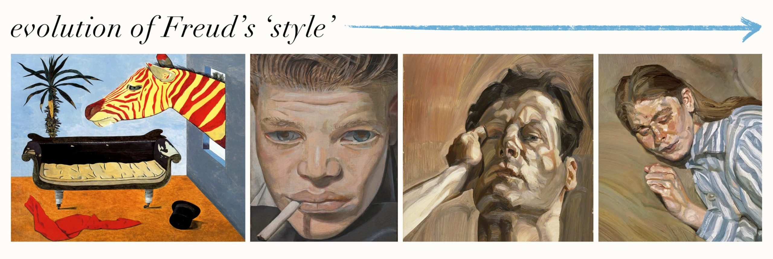
Don’t be a Slave to your ‘Style’.
If our style doesn’t evolve, we’re not evolving. Freud wanted to make each picture better than his last, and his style as a result went through several changes throughout his life. Style wasn’t a concern of Freud’s, although he acknowledged this demand to keep improving meant it was hard to keep his paintings consistent.
Do be a slave to your vision (if you must be a slave to something). Instead of worrying about what form our creations take, we can worry about what, if anything, we’re actually trying to communicate. I’m a firm believer that if we get to know the ideas we want to communicate, well enough—understand its indulgences, its violence, its silence—our vision will emerge in whatever form it needs to be in, not what form we wish it to be.
What these Lessons Say About My Own Path.
Writing all this down gave me a better sense of where my own path might take me:
I’m certainly attracted to details, not grandeur.
I don’t like extraneous, decorative details.
I’m attracted to the sublime, not the beautiful.
Knowing this about myself, I can use these guidelines to diagnose what is missing from my work when it fails to surprise or satisfy me. I can use these as jumping off points for my own pictures—deliberately exploring these ideas or their opposites. What if I did a series of paintings only using grand gestures and neglect the details? What if I try to make a painting as beautiful as possible?
Using such experiments we can test and play with our hypotheses of what we like and don’t like, gaining clarity about our own creative vision while engaging in dialogue with great artists whose wells we continue to draw from.
- Crow, Jonathan. (2018). “Moebius Gives 18 Wisdom Filled Tips for Aspiring Artists”. Open Culture.
- Ibid.
